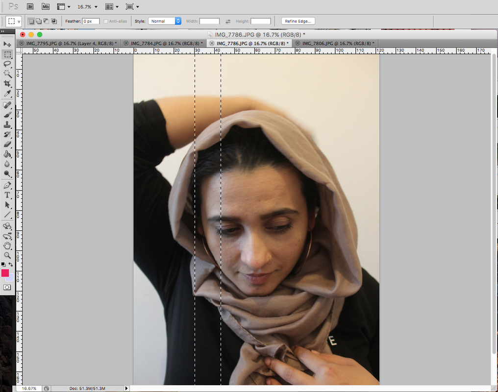
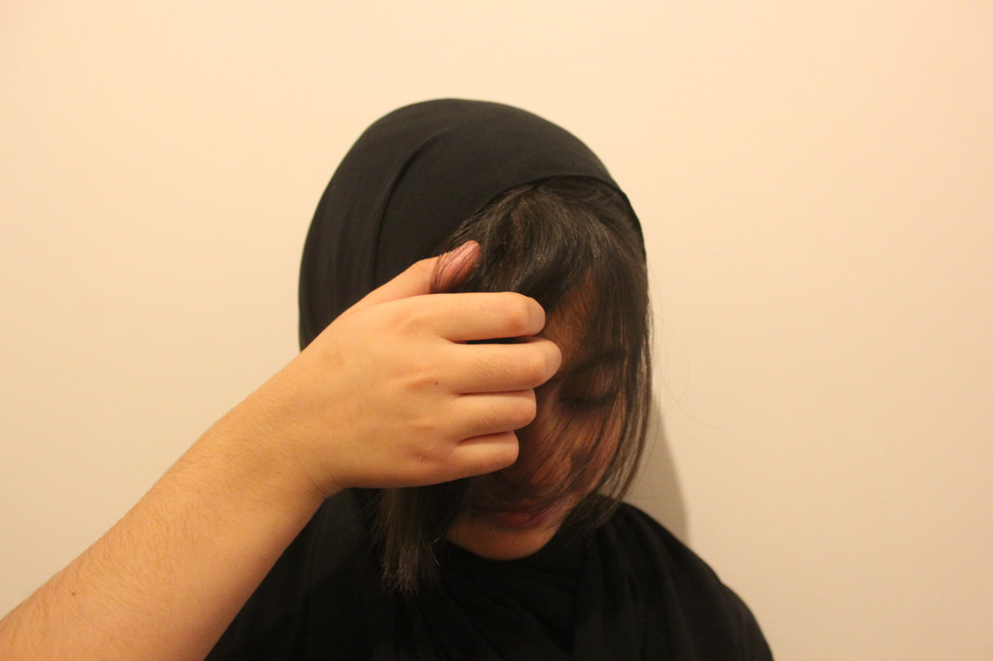
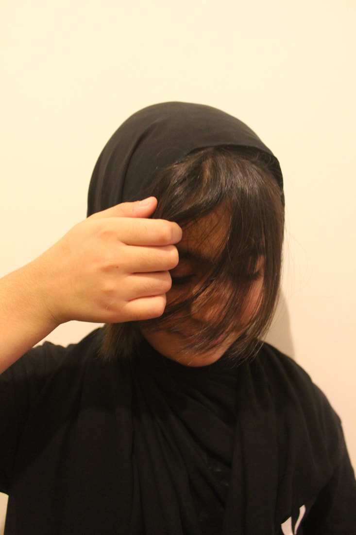
portrait transformation
When a portrait image of a person is taken and destroyed and or transformed into a different image that has the same silhouette or with the same person organised differently. my intention for this task is to cleverly destroy portraits of myself and a celebrity and to try and incorporate our personalities into the distruction.
rosanna jones
Rosanna Jones a graduate from Falmouth University in Fashion photography based in London who mainly works in mixed media imaging and fashion photography. A lot of her work consist of the destruction of portraitists and working along side different types of celebrities. The fact that she transforms the images implies how she might want to portray the cliche of beauty being more that skin deep.Most maybe even all her work is with females implying how females are underrepresented and how she wants to share how we are more than what we look like. In her images she uses a muted colour palette that would stereotypical be associated with girls, furthermore the girls that she uses are normally in their youth showing off the subjects at their prime. I think the way that she incorparates collage into her work makes the images more personal and relative to the artist.
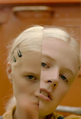
In this image she uses photo shop to create a clean overlay of two images with straight edges. In each images the subject has a different facial expression which can mean how we can be feeling two different things at the same time. By overlaying the images cleanly it shows how she wants the focus of the images to be on each of the facial expressions.
|
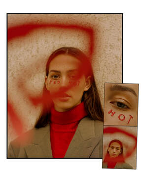
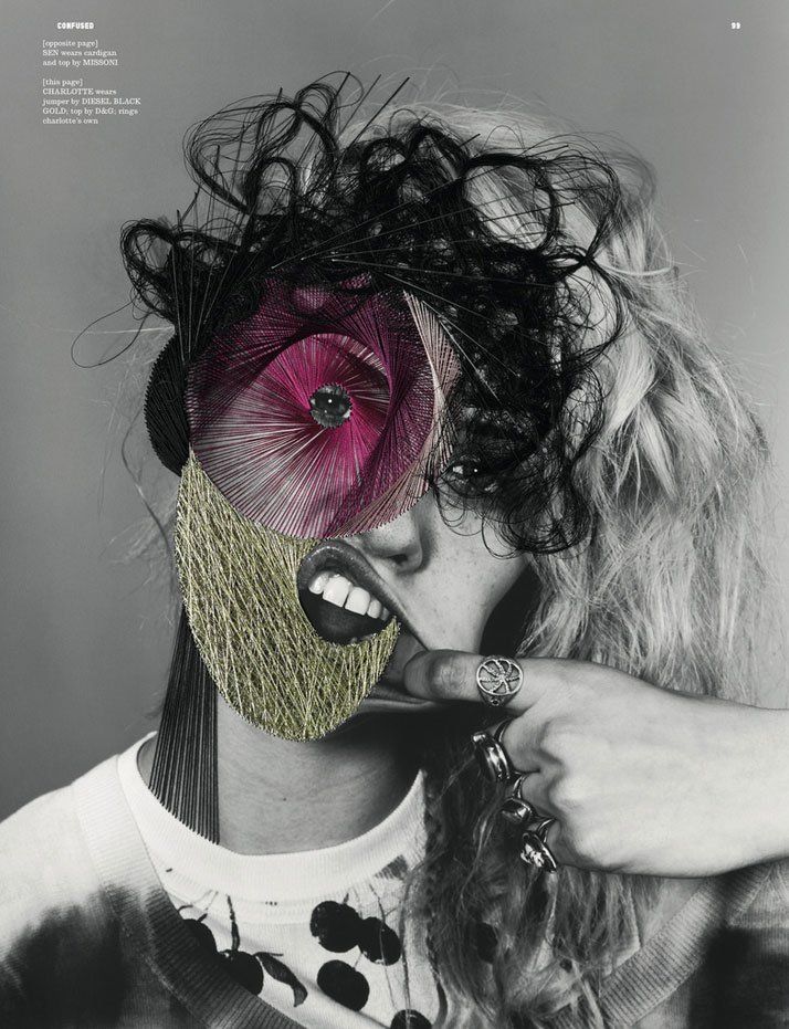
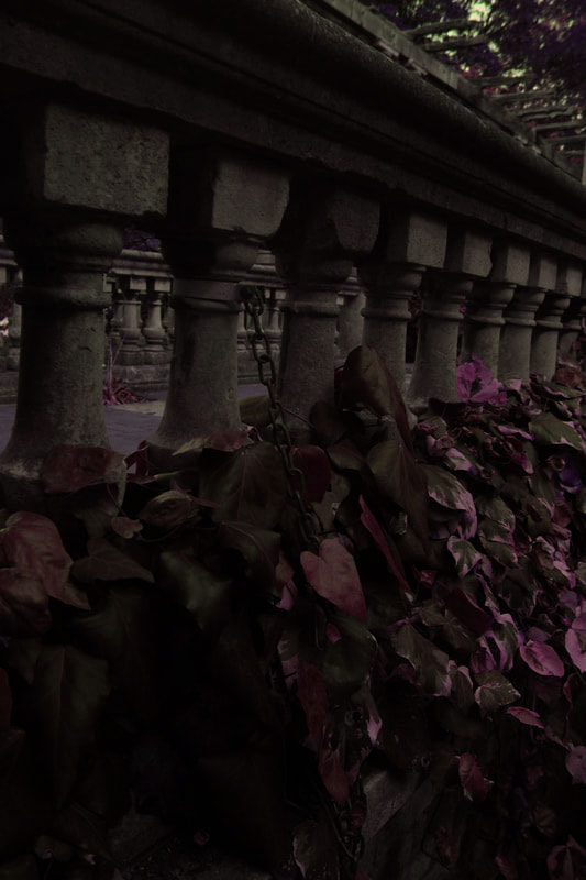
.Rosanna disturbs this image with the medium of graffiti and labels. She also collages the picture with focal points of the bigger frame. This can mean the way that we expect a women to portray themselves can differentiate and how labels are the things that are causing the problem. The use of the red being the outstanding colour can make the observer think how we are causing women pain through labelling and expectations
|
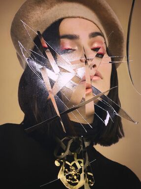
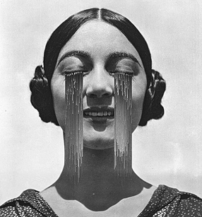
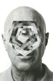
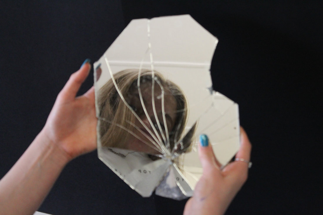
Here Jones manipulates the image by photo shopping the images to look like shards of glass. She makes this the focus point of her images. She also layers the original image underneath the shards to show what it looked like before. By doing this it shows how we can break down a person until they are completely broken and shows the damage we do as a society.
|
lola duper
Lola Dupre a multicultural collage artist and illustrator who is located in Portugal and mainly work in surrealism and fragmented portraits. She has worked with clients like Penguin books, Time Magazine and Nike basketball. Her images are distorted in a way that confuses the mind and they are played in black and white. She also works with animals and disorientates them. Many of her pieces are aged and wouldn't look like they were made in this century. I think when we look at her images she wants our minds to travel back into the past and what we know of it even though she lives in the modern era.
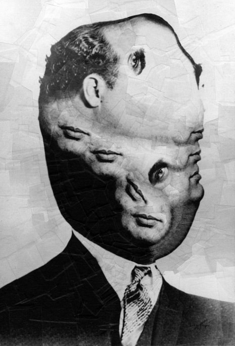
She has created an image that is almost contained within the head and shows how we are all locked within ourselves. She copies parts of the face and combines a front portrait and a side profile picture into one. You can tell that she used more than one image to create this piece as some of the angles that the lips are seen from would of been taken from the front.
|
Dupre shows and image of a happy looking women but edits the picture so that she is crying. Instead of using ordinary tears she makes it seem as though there is a waterfall which can imply how sometimes tears can be endless they also take over a lot of the face which implies that that was her focus point. It can also show how whenever someone is crying their tears are the only visible aspect on them at that moment.
|
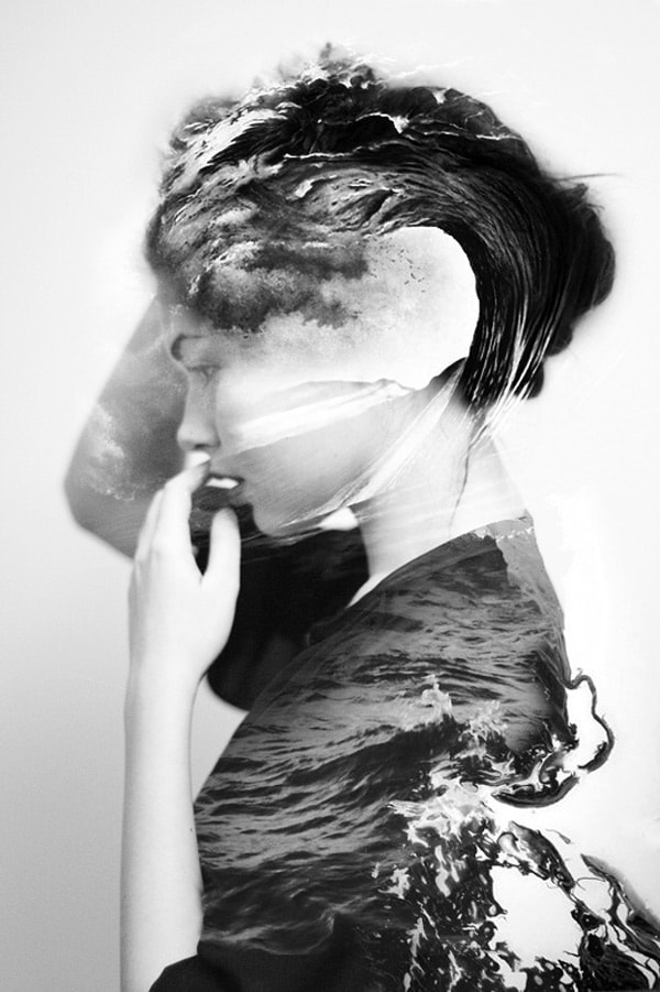
Here it looks like she uses double exposure to create the image. She cleverly makes that waves move the way of her body. Because of the shape of the waves it can lead the eye to follow the way the waves are splayed out. She could be trying to personify the fact that most of our body is made up of water and wanted to showcase the artistic way of how it could look instead of showing the fact scientifically.
|
maurizio anzeri
Maurizio is an Italian artist who is based in London who is known for his series of eerie portraits and photo sculptures a term he likes to use for the type of portraits he likes to create. He has done a lot of work with vintage images and has sewn directly into them. He describes his sewn portraits as elaborate costumes in the way that he garnishes his figures. The vintage portraits that he transforms become disturbing and possessive to look at. The fact that all the pictures that hes done have been vintage shows how he wants to bring back the past. Below are the more recent pictures that he transformed of more modern people.
This image creates a more punk rock vibe and the way that he makes the design is as though he is creating a whole new person. He creates an overdraft of the sewing and takes up only half the face but seems like it would take up more giving the observer the wrong illusion.
|
The movement of the hair hasn't been touched were normally he would create a touch of differentiation if there is movement in the hair. As well as the fact that only half his face is engulfed with stiching and he has kept to the sillouette of the face which is something out of the ordinary for most of his pieces as he normally likes to engulf the whole part of the picture with his sewing.
|
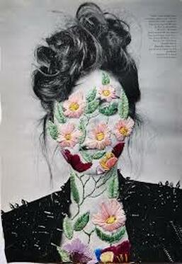
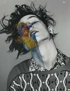
Here he uses flowers to embellish the portrait which can indicate the growth of people. But the subjects eyes are also closed and he wants to imply how we can be blind the new forces of life and the change that we experience.
|
john rankin
John Rankin is a famous photographer based in London he is the main inspiration behind our portrait transformations and our work is based off of the way he created his images. A lot of his work is with celebrities and his most known series was with a group of them where he would take portraits of celebrities and let them choose how they would want to disfigure the picture giving them their own personal touch. This makes the personalities of the celebs and how they feel real and different from how they would normally be exploited to fit into the way that the media wants to portray them. When putting them all together he put the original and the collages of the images side by side.
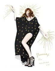
In the image it shows the excitement and happiness of this celeb which is shown through a example of a sun. I think that it would of been better if there portrait was close up and just of the face but I liked the fact that it was quite monochrome and the only colour being the gold.
|
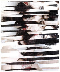
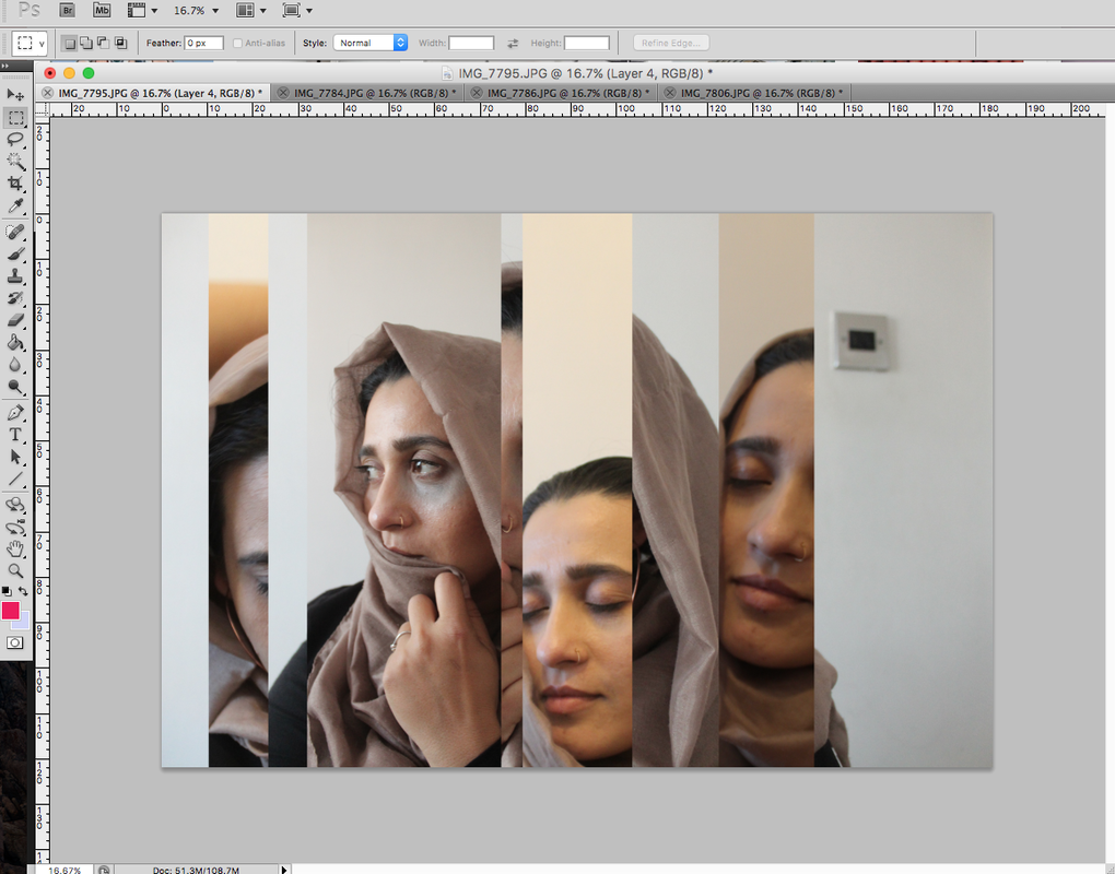
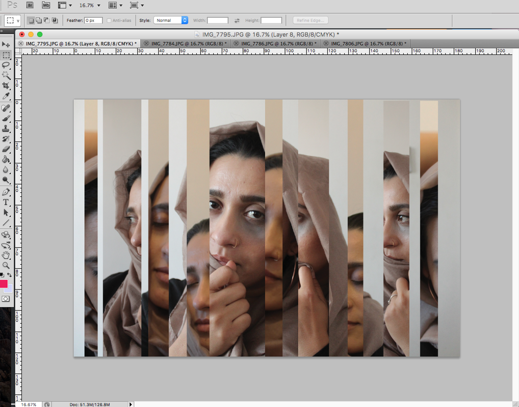
This images was totally taken apart and put back together. The colour skeem of the portrait flow well together but the only thing I would change is if the strips of the cut of photo were closer together.
|
my interpretation
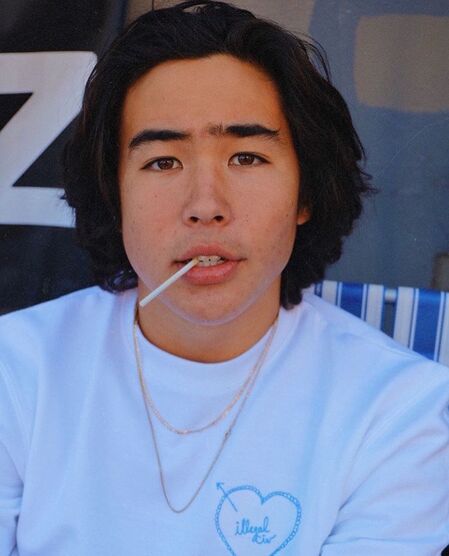
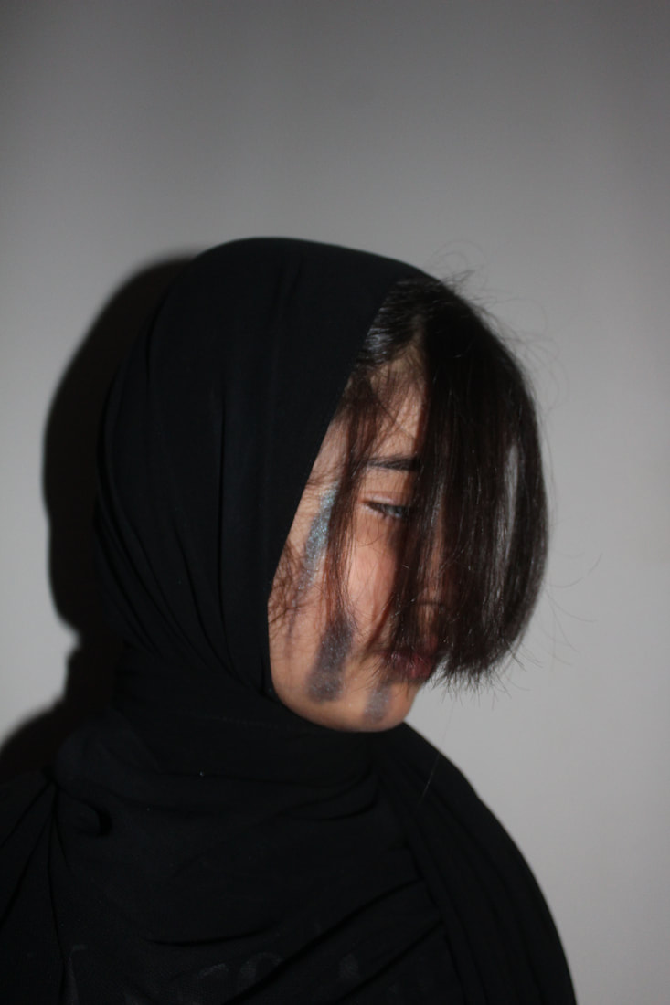
I used Nico Hiraga who is a skateboarder you tuber and i tried to interpretate that as much as possible into the transformation to make is seem as personal as possible. I think that WWW was the colour scheme and the keeping the personality of the celebrity present in the portrait transformation. The EBI would be if the eye colour wasn't changed so that here isn't too much to look at.
|
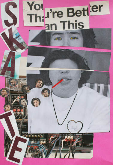
|
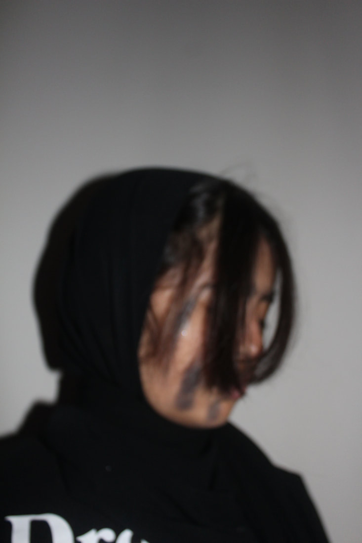
in this task I was required to create a distracted portrayed to emphasis the fact that more can be told through in image in a lot of different ways and through different medias with can make the image a lot more complex and diverse. The image is an image of a famous skateboarder YouTuber. The image was inspired a lot by John Rankin and Rosanna Jones who both used different medias to express a clear image on what they wanted to depict of a touch of personality of the subject and an image that is broken down and sectioned through being altered after the original image was taken. Rankin's work was slot more personal and more about the character of the person he was taking the picture have. So for my piece I decided to make a collage around the subject who was a skateboarder which is why I imprinted the words SKATE in. The materials used in the process was sugar paper for the background colour and then we were given magazines to look through and incorparate cut outs from the magazine and make a collage. I think that the image is a clear depiction of the personality in the original portrait. I carried into the collage his personality through the amplifier in the back to the obvious statement of who he is thought the words SKATE. I think the images arent in focus as much as I would want them to be into image on the right looks a little grainy but I think the pop if pink makes the image pop out. I would need to change the F stop to make the picture have some more depth. In the redo of the project I thin if there was less colour in the picture it would give the message a lot clearer. But I think what went well was that the subjects personality was captured clearly through the collage.
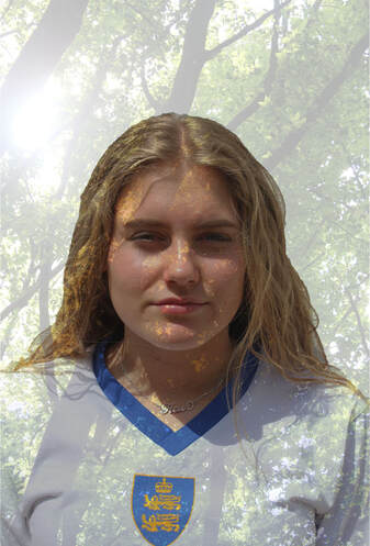
double exposure
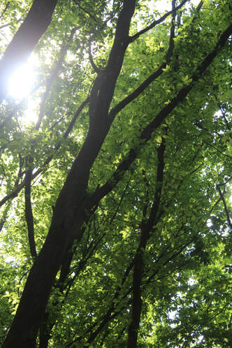
The repeated exposure of a photographic plate or film to light, often producing ghost images. The transparency of the two characters is a result of double exposure. My intentions for this task is to take a portrait of man and nature that blend well together whilst layering them together.
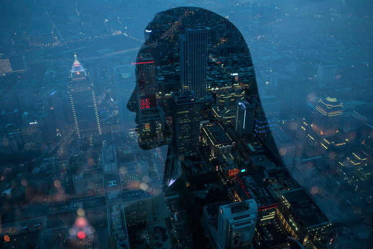
christoffer relander
Christoffer Relandars most famous series and what he is mostly known for is "We are Nature" in this series he used the technique of layering images over each other with different exposures creating a surreal image of the relationship between humans and nature. This technique is called double exposure the nature is so exposed that the identity of the person is hidden creating sense of privacy. Through the images you can tell that he focuses the portrait around the image of nature. He sees how the nature is going to blend together with the portrait. By mixing in nature into the portrait the image has a lot more texture even though the images are only in black and white it gives the image a lot more of an impact and gives the images more depth and innovativaty.
This is probably my favourite image out of all three of these shots. The way the bark is placed in the face looks intentional and shaped very specifically to the face. It quite a contemporary twist on a basic portrait. The fact that the eyes are concealed gives the image a lot more of an impact and I think he placed the bark there to make the image a lot more emotive than it would of been with the audience able to see her whole face. The way that the foliage is growing out of the bark gives the nature incorporated a more smooth transition onto her face. the image make me feel quite emotional and sensitive to why her eyes are concealed and makes me wonder why we are unable to see her eyes. Also I think the reason why the bark is in such a harsh colour is so that the feelings of the subject is relayed really clearly.
|
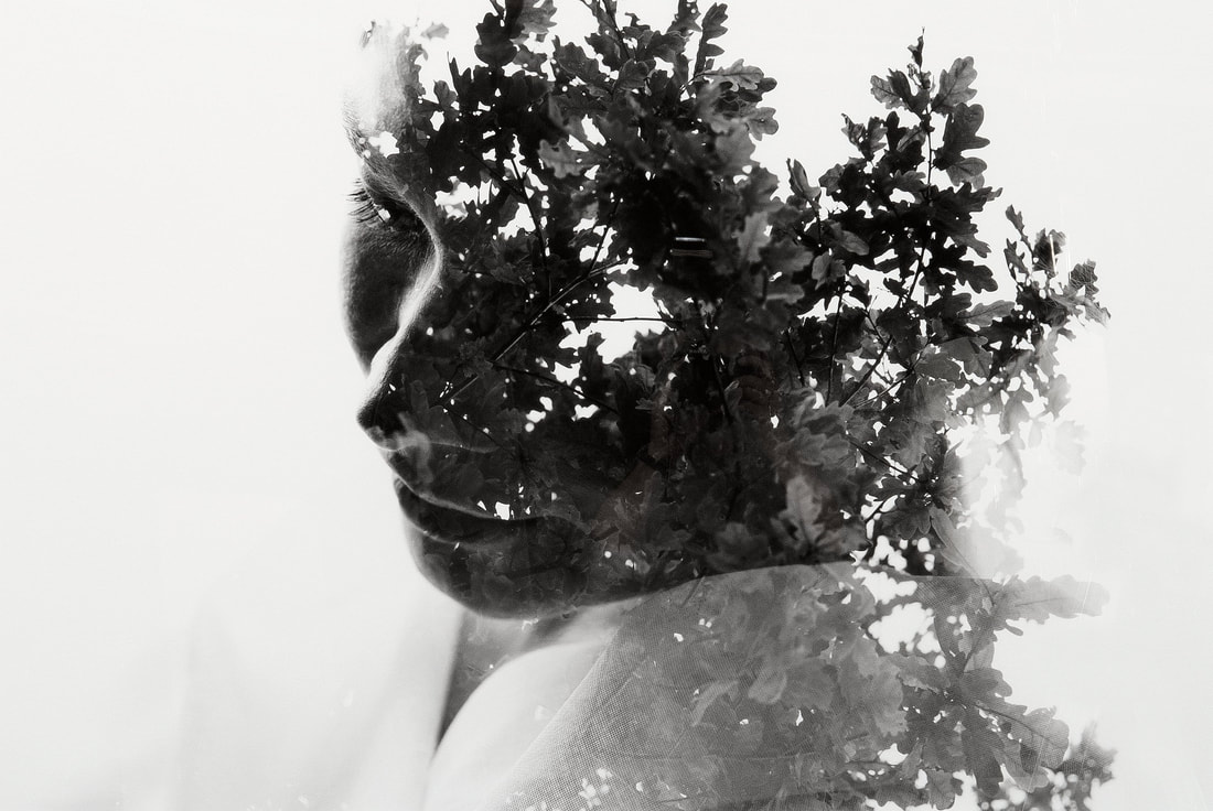
This image looks like the subject feels a lot more serene and peaceful. The comfort of how she feels I think is also shown through the types of nature that he uses and I think the reason why he chose flowers was to further symbolise how she was feeling since flowers are seen as blissful and beautiful. Which is why I thin he rose flowers instead to almost emphasise hw she was care free. This also further shows how he carefully picks out what type of nature he wants to reflect into the iamge instead of juxtaposing the way the subject feels which a harsh part of nature. Also the fact that he carries through all his images is the way the flower is transitioning out of the picture through the brain.
|
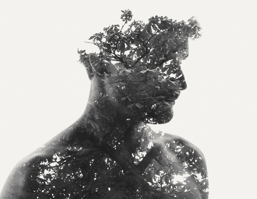
In this image he put in the image a lot of gaps for sunlight which created more exposure in the image. The gaps in the subject made the transition through the subject more intense and stern. He also purposefully placed a gap of sunlight on the subjects eye which made the image mysterious since the feeling of the subject isn't as clear as it was in the previous two images. The way the trees cross right at the centre of his chest I think is purposefully done as to show where his heart is placed.
|
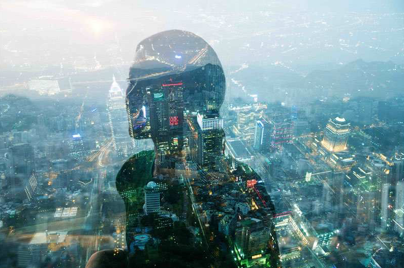
jasper james
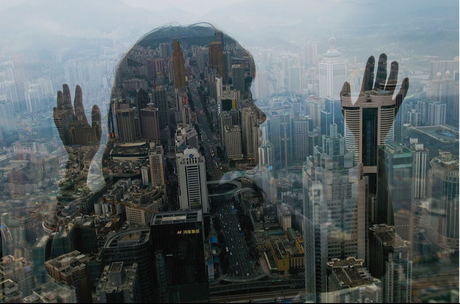
Jasper Jameses portfolio includes editorial and corporate projects as well as portraiture and concept driven projects. He is based in Beijing and Shanghai. His work that links to double exposure is a series called "City Silhouettes" in which he takes pictures of city skyline and blends it together with portraits of people looking into the view. His work is a lot more contemporary than most our to the fact he uses urban buildings instead of nature like Redlander. He also keeps his background filled with another layer instead of keeping it all white and solid as well as keeping it in colour instead of monotone. The fact that James lives in a more urban city like Bejing has an impact on his work which is why I think he uses city skylines for his double exposure and just keeping the silhouette of the person instead of keeping in features like Chrispher did. both of these artist images fell in the same catorgary but were polar opposites with the same aspects and they juxtaposed each others work. In the images below he uses the same skyline for all three of them but takes the opictures at different times in the day from morning to midday than midnight.
James uses a nighttime skyline with I think is representative of the person in the image because she is of an older age and I think he is trying to emphasized how the day has matured like he's telling a story. the work is clean and refined lines because if the urban landscape. I think he layered the two images over each other of a window with the reflection of the person and layered it onto of the skyline through he took the picture through a window. This picture makes me feel like I have been transported into the future the lights give the image vibrancy and colour.
|
|
in this image it's transitioned to the day with the same skyline as the previous two images . He uses a person at a time in their life that reflects the time of day. For example in this image he uses a kid which is a reflection of the fact that the day is still young with is why I think he chose to layer the morning skyline behind the child. The fact that the Childs hands are up against the window I think shows that the child is locked in and want s to be free with is what a lot of kids feel like they just want to be outside enjoying the weather or playing outside wit their friends.
|
first interpretation
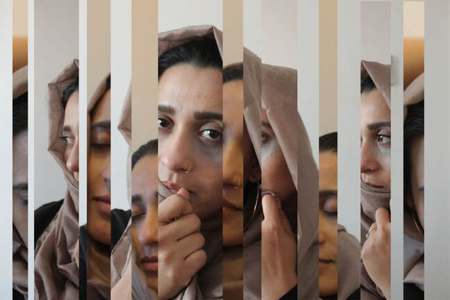
For this shoot I decided to follow the inspiration of Christopher Redlander and to use the double expose through nature and layer out the nature with the white background.
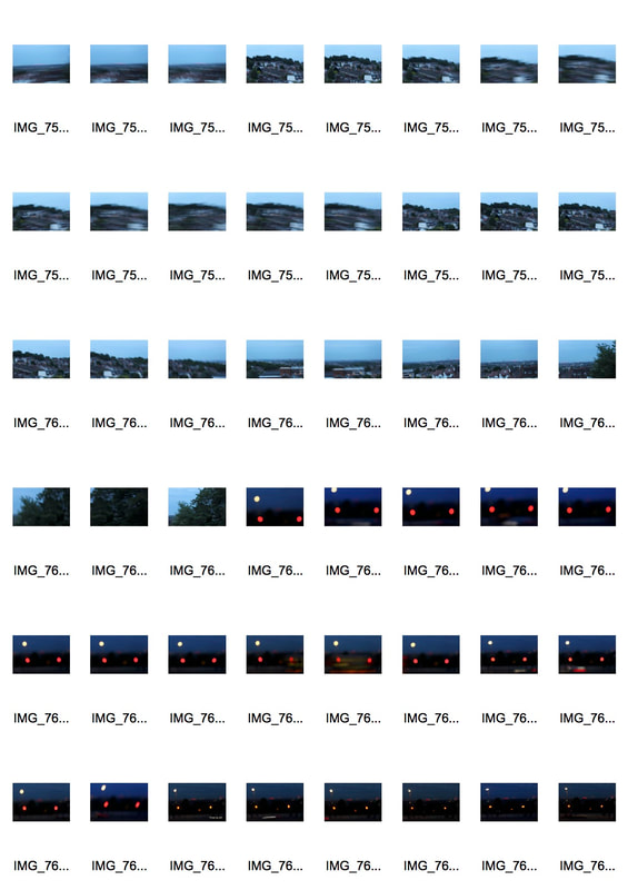
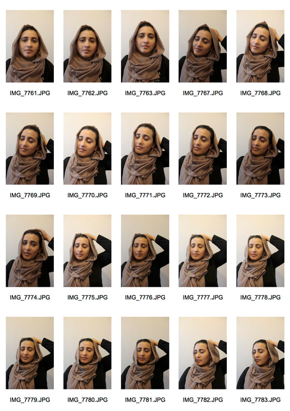
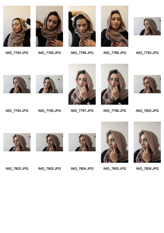
contact sheet
|
|
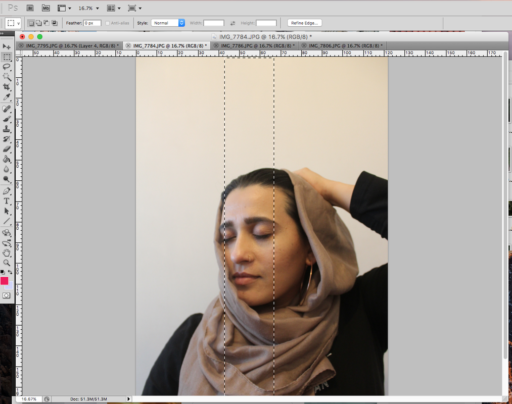
For this shoot I took my main inspiration from Christopher Redlander and I created an image of double exposure so that I could reflect my skills in layering with I think still need to be improved and my transitioning skills of the nature to the person. I used the process of layering the nature image onto of the person and changing the opacity of the layer but to avoid having to make the background blank we took the picture on a white wall. I don't think that I took enough pictures for both the nature and the person and I think I should of got my subject to show more emotion so that I could of reflected her emotions with the foliage that I used for the double exposure. But if I had taken more pictures then I would of been able to have more a variety . In the editing process I made the saturation higher so that the background would stand out more. I don't think that my image of the nature is in focus and if I changed the aperture then there would be a higher depth of field with I think was needed for how far the tree was. So if I was to do a reshoot then I would focus on taking more pictures and to take images from more viewpoints.
force of nature
In this assignment we were to take images were nature has taken over and almost like it's reclaimed the world back from all the manmade structures and the destruction we have caused through this process.
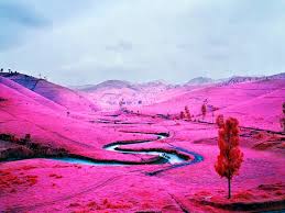
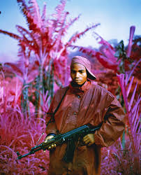
Richard Mousse
Mousse is an Irish conceptual documentary photographer who gained recognition for his photographs of the war in eastern Congo and his intention was to create a new perspective on conflict . He has further worked with other brands like designer brand supreme with the same style of photography as his conflict pieces. The fact that he uses vibrant really saturates hues and colours makes his work seem like it was brought put of a fantasy with is them opposite of what the locations of his work are representing i.e war. He is also known for his strand Incoming with he creates almost an X-ray type of visual on a disastor zone of a spreading virus. His work is political and hits on relevant subjects with makes his work all that outstanding.
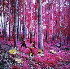
Here he takes the challenges of deforestation and the raw hard work that they have to manually go through to provide for themselves. This image further shows its strong opinion through the vibrant pink colours used and keeping the people of the image in there normal for and not putting any altrications on them. The colours that he uses are quite saturated and concentrated. I think by showing unnatural colours of the environment it can translate in a way to say that the labour and work that they are going through is unnatural and inhumane. The image makes the observer feel mixed emotions because when you first look at the image it just looks like pink trees but when you really look into the image the real message is seen and it takes there feelings of the fancy into sadness.
|
|
This is a really intense image from the colours to the way the positioning and the objects in the image. The fact the person isn't looking at the camera I think reflects the fact that the soldiers can't focus on anything in the present and have to be aware of their surrounding. The fact that Richard was making the colour of the soldiers jacket a similar hue as the trees and grass behind him shows the camouflage that they need to have to. avoid the danger. The subject blank expression shoes that the soldiers can't be worried on anything else except on the task at hand. The image make me feel conflicted due to the colour and then the intense message behind the picture of how severe the soldiers are taking the conflict in Congo.
|
my first response
For these images the message behind them wasn't as intense as Richards message but to just show how we have taken over the natural world but the environment is trying to take back what's there's. I wanted to present a simple but vibrant message.
|
|
|
|
|
I tried to create an image that had the same colourful impact as Mousse and the fact that it looks unrealistic and takes the observer to a vivid image of what the world would look like if the plants in the world were all these odd colours. Richard inspired me in the really vivid colours that he used and the fact that its still not altered the background too much that it would affect the rest of the image. The process to getting these images was actually quite simple and it was to just change the hue and saturation of the image but you would have to be careful to not go too high or low to affect the rest of the image or make the exposure too strong. I think that I did take enough images and that the images had a lot of different viewpoints and focuses depending on who was looking at the image. I think by caring the viewpoints of the image it give me more options to what the image would look like from certain angles. The focus of my images I think where quite in focus and they had a good depth to them in focus. I think the focus point for both images is quite clear. But I so think the positions of the images next time would need an altercation as I don't think they are as centred as they could be I only think that I would need to do a reshoot in a more urban background were nature has tried to take over. I think that the colour change has worked quite well and the manmade structures hasn't changed colour so it makes the image look more natural. If I was to do a reshoot I would also incorporate people into the image like Richard Mousse. But what I enjoyed about this shoot was that the nature was reclaiming quite dated old architecture with stone elements which still kept the textures of the image environmental but in different forms.
force of architecture
Through this task we were inspired to create the way buildings have developed and become more rugged but at the same time sharp and clean lines have been incorporated.
simon phipps
Simon Phipps is a photographer based in Britain and he travels all around England especially the North to capture images of brutalist architecture and then proceeded to edit them in black and white. Many of his images are geometric and leave patterns of of where the sky escapes into the image. He was also known for his "Screen print" series in which he would edit the images to blocks of black and white then image had a lot more of a contemporary style due to just how he edited them and the type of buildings he took pictures of. He further continued to make his images have an impact with how empty his surroundings through the image was. His main theme and specialisation through architecture create an image thats more urban and captures the life in cities.
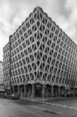
In this image it looks like he trailed to Barcelona scene there is a lot of sculpture in their building work. This image is also very cleverly positioned with the corner of the building acting as the sharp edge in the centre of the image. The repetitiveness of the windows and the triangular shape of them creates a geometric effect. The fact that you can see the movement of the clouds through the shadows and tones in the black and white makes the image come to life and it looks like the trick of the eye and that the image is moving the clouds also give further depth to the image. The scares few people at the bottom of the image is almost creating a natural rule of thirds effect and it makes the building look even bigger with the people at the bottom.
|
|
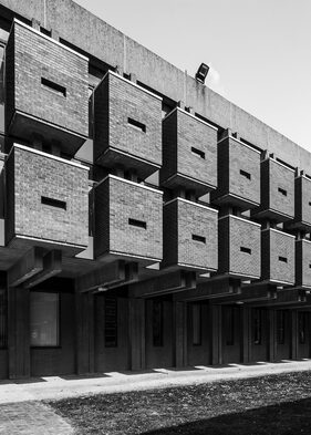
I really enjoy how peace fun and calm this image makes makes me feel and the way it reminds me of the barbican making the image feel a lot closer to home and relevant. The brutalist architecture that he takes his pictures of shows his appreciation for the building when often they go unappreciated because they look too gloomy at times. He carries through symmetry and repetitiveness through his work through the shadows and the geometric boxes with I think give the image character and dimension. But what makes me like his images that much more is that in his pictures you can always tell what time of day it is in the images like for example in this one the picture is taken during the day and and you can tell from the high exposure on the ground which almost looks pure white.
|
my response
|
final piece
|
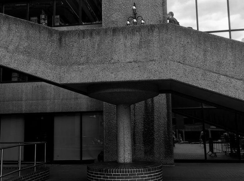
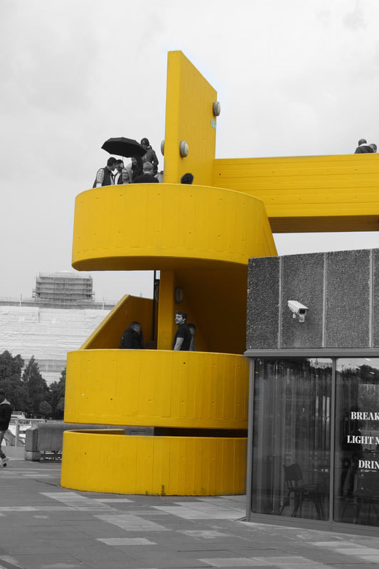
I really enjoyed taking pictures for this stand as it made me become a tourist of my own home through the process of taking the pictures from travelling from the barbican to the Southbank. London was also a perfect place for brutalist architecture as both these locations was filled with brutalist architecture. This also gave me to explore the different ways to take images of subjects on such a big scale and view the different angles that can be prosecuted through the process. Simon Phipps was the main inspiration as it made me think about the compositions that he would try to create in these images. The staircase of the barbican I think created a natural rule of thirds effect with the staircase acting as a divide. The building with all the triangles on top brought a lot of geometric styles with the rectangles and gaps for windows and I liked how there was a deep shadow in the image where the window would normally be placed and the shadow that was created under the building. I enjoyed placing them in black and white because I think that emphasised the shadows a lot more. My favourite image is probably the yellow stair case because it contrasts against the balck and white background and becomes the obvious central point for the image. I also like the fact that I was able to capture a black umbrella because I think that it made the yellow pop that much more. The thing that iw Ould change about my images is to try and get them as straight s possible and not look so slanted. My process for editing was mainly the same by cropping the images to the desired side and turing them black and white but then changing the levels to get the perfect black and white contrast. The different with the yellow staircase is that I duplicated the layer and then places one onto of the other and rubbed out the top layer of the staircase that was in black and white to show the staircase under that was still in colour.
force of movement
in this task I was required to capture a movement through all its stages. To make a collage that capture the moves of the body through a simple process.
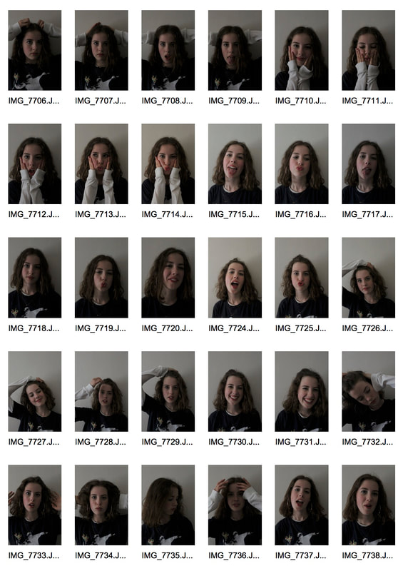
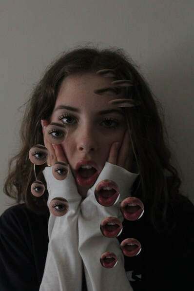
This was probably my least favourite stand simple because ether wasn't a lot of different photographers to find to gain inspiration from and the fact that it didn't require me to learn anything new in terms of skills or composition. But I did like the way the image turned out and how every image was captured through a fast shutter speed and the facial expressions of the subjects which gave the images a whole new perspective and more character. The image also flows really well I don't think that I took enough images for the project but I do think most images are in focus but because all the images are so close together the image looks messy and all over the place. The main process was to layer the images one at a time from the first images and rub out the images one by one. But I do think that there are some gaps in the image where there should be the image.
3 Strands
strand 1: force of propaganda
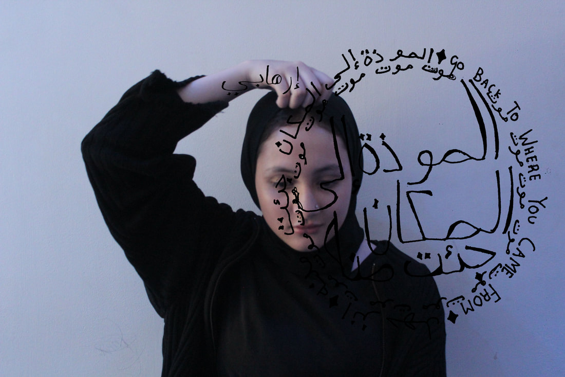
shirin neshat
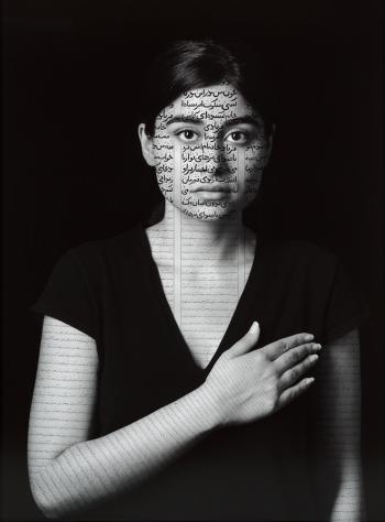
Shirin is an Iranian visual artist who lives in New York city and is known mainly in her work in film, video and photography. Her work is mainly centerd around Islam and the west, femininity and masculinity, public and private life and other opposites. She has won many awards like being named Artist of the decade by Huffington post. Her work is very cultural which I haven't really seen a lot of. The way that she incorporates calligraphy and different types of media makes the image a lot more interesting.
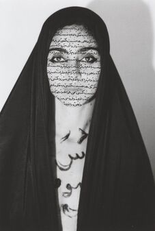
The way that the shawl is layer on top as the only piece of clothing makes the subject look a lot more venerable connected with the facial expression and intense makeup of the eyes. The emotions look very blank like she hasn't been aloud to have many feelings and she looks very hurt. The way that she creates these images makes the observer really curious the style has contemporary meanings behind the image and personal. The image looking at it makes me feel emotion because the raw expression on her face. The simple aspects of the image with the incorporation of the image being in black and white creates the focus on not what colours could be used instead and what the meaning behind the Arabic could be.
|
|
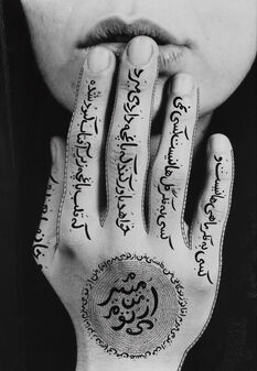
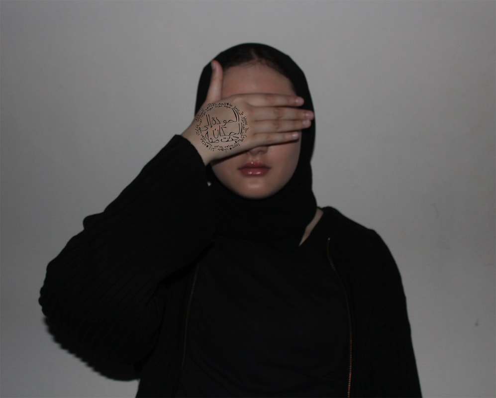
The fact that the hand is the main focus makes the image different and curious the way that she manipulated the writing across her hand is really smooth and looks like a glove that fits perfectly moulding all the way through her hand. The fact that the only thing that of her face is showing is her lips shows that the message of the image is something to do with the speech of a person or the lack of it. The bold Arabic creates the focus of the picture the way she always puts the images in black and white shows that you don't need colour to creates an interesting image. Also the political messages that she is emphasising shows that she is brave with her ideas and that she has no fears of any back lash with shows that she's fearless with her images and wants to send a message along with creating bueatiful image.
|
my response
final piece
|
|
|
|
This is probably one of my favourite shoots of force so far due to a lot of different reasons with it being that its got a personal message for me and that I was able to showcase my freedom in photography. I also really enjoyed going through with a lot of different medias in the image to incorporate more than one style of art. I liked that the subject had a neutral colour on her with aqlomost made the image a dark blank canvas and made the black Arabic pop out that much more. The way that the model posed through the pictures I think really captured what I was trying to portray and that is that we are made to feel trapped just because of how we look or what we believe in and that and we feel threatened to conform to what society wants us to do. Also I enjoyed the fact that we weren't just taking picture to look pretty but also so that it had some sort of effect on the observer. If I was to do the shoot again I would try to perfect the way the calligraphy is shown in the image and to make the lines of the calligraphy more fine clean. I like the fact that there is a blue hue in the first image growing in through the corner of the image.
strand 2: force of people
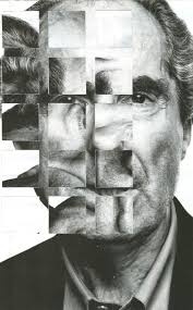
gordan mangin
Gorgon is a Nevada based artist who works with photography, scans, collage and altered found images. He uses geometry pattern, repetition, form, perspective, composition and systematic objects. He does this to distort and challenge intended objects to interpenetrate them on consumer based images. His images were really clear through the different shapes and didn't look pixelated at all. The way that he centers all the images to the middle of the page creates all the concentration of the observer into the centre.
|
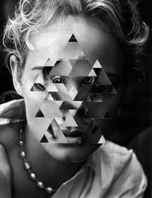
The fact that the other two in this stand are in black and white makes this one stand out more and the fact that the other two that are in white are of older men whereas in this one the background is black with a youthful model. This juxtaposes the way that day and night work since day comes before night and youth comes before becoming an elder. I like the geometrical shapes that he uses with the triangles and that he only uses one type of shape per image it wouldn't confuse the observer with it looking too messy and all over the place. This image makes me feel confused like I need to put pieces of a puzzle together and try to unjumble the triangles to find where they actually fit into.
|
|
The image I think looks too pixelated so if I was to redo this shoot I would change the f stop so that the image would have more depth and that it wouldn't have such muted colours with I think emphasised the graininess of the picture with I think made the rest off the image become not very pleasing to look at to the observer. I think if I was to change it to black and white and levels then the image wouldn't look as grainy. But I also did enjoy the way that the way her puzzles of her face fell down was more simple because I didn't have to decide how the pieces would be placed together. If I was to do a reshoot I would take more pictures and make sure that the image wasn't as grainy and place the puzzles a different way. I would also try to experiment more with the type of collages and cut outs of the subject and try and rearrange with the same type of geometric shapes. Also they would be place more systematically and have sort of pattern that would make the piece look like its got more purpose.
strand 3: force of environment/places
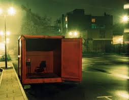
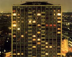
rutt blees
Blees is a German photographer who techniques is to take photographs mainly at night and a tutor at the royal collage of art. her images are also taken in abandoned desolate locations with furniture that is old. they are also pictures of the more modern placements of architecture that she takes at night. The vibe of her images remind me a lot of London and the third image reminds me of the council flats and the life of how they look from the outside they colours remind me how London would look at night. In my shoot I would incorporate lights into my image and how they move.
|
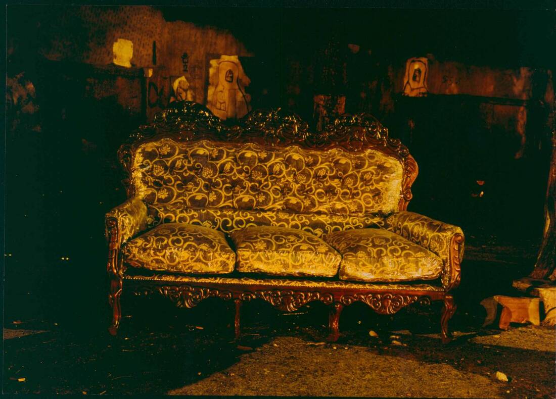
They way that the sofa is placed in a desolate looking place make you think of all the rundown and nit looked after areas of London. The fact that he mixes a vintage sofa that would be placed in a higher class home with the more working class background at the time that these types of sofas would be made juxtaposes the way that he views life and how he incorporates and thinks of all types of people. He also makes the image look more vintage with the lighting or filter that he placed on top with a more orange hue that takes you back in time. Also the fact that the sofa looks untouched shows how the past can't be touched anymore and we have to just leave it behind at some point.
|
|
|
|
|
|
|
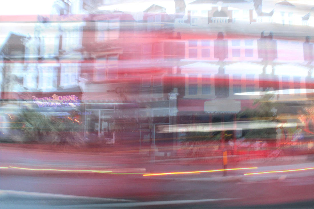
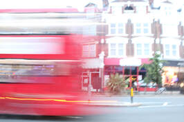
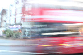
I really like how both of the layers show the same background and that the lights in the image have some sort of direction. its like that the pieces just fit together naturally. I had to stay quite still and patient to wait for a couple of buses but I also too some of thew same bus just whilst it was moving but on a slower shutter speed. The red really stands out but dent block the observer from the rest of the image and that the shops in the background mould together really well. I also like how you can also can kind of tell what the purple sign at the back says. Also the red in the back makes the red of the bus pop out a lot more. I also like how that the busses look like they are merging together and the piece gives a futuristic feel. If I was to take the shoot again then I would make the time of day different and not have the subjects moving around so that it doesn't look as messy. I would also try to make more edits of the strand and to give more different visions of the image and angles of what the image could look like.
Favourite Strand: development one
Explain why you chose this strand and what your intentions are in this new set.
The reason I chose this strand is because I thought it was the most personal to me and it has a message behind it that I believe. My intentions of the task is to layer a lot of the images so they fill up the page and then I want to fill the empty space with the message that I'm trying to send do that its clearer. I also want to send some sort of message without words that leave the observer something to take away.
|
|
final piece
For this piece I wanted to take an image of someone I admired (my mum) and show theme through what the actions of other in the general media and stereotype of who she is does and how if affects people. I also wanted the image to have an impact so I created one image to look at the observer so that when ever anyone was to look at the picture it would be really intense like a staring contest. I wanted to make an image that made an impact that almost told a story and something interesting and personal to me about how the way that we are represented in the media and in life hurts us but is invisible to the audience. The fact that the other smaller clips are not shown to the front is to make the focus image more obvious. If I was to do a re shoot then I would change the set up or colour wheel of the picture and maybe try the simple approach of black and white.
The process
|
|
|
|
Ideas to help you develop your theme....lucassimoes Shadi Rezaei - Iranian graphic designer (left), Shephard Fairey (centre), Manal AlDowayan (right)

|
|
|
This piece was quite experimental into how the way this strand was flowing through. I also wanted to try some new compositions through blur that was intended and the way that the makeup is placed on her face. The way that the makeup was placed to give more of an intense deminor and to bring out the colours of the background. It also further represented the marks that we are given from society and how it creates and imprint. Through this strand I wanted to create something that was more meaningful and wasn't just another pretty picture but also to get a conversation started about why I created this piece. Maybe its not obviousy shown or had intentions but I made it in a way that wasn't too simple or too much. Through this strand I have learnt new ways to learn photoshop for example how to intensify certain colour. I also used a longer shutter speed to get the effect of the blur and the movement transitioning. Next time I as to do a piece or a reshoot I would defiantly take more picture with either different lighting and just more pictures up in general.
favourite strand:development two
inspiration: Shepard fairly
|
This image is something I came across when. I was searching for inspiration for my propaganda. The reason chose the image was because it had a lot of components other than a simple image. I also like the way he incorporated a lot of graphic elements and that different media is used. I also like the culture that he inspired into the image. The sullen look on the subjects face gives the image more emotion and creates a message behind the image. Fairly is known for his images that ignore the normal standers and fight what he believes is right in political ways. He has created a lot of images graphically that inspire and create a whole new outlook into photography.
|
|
|
|
final piece
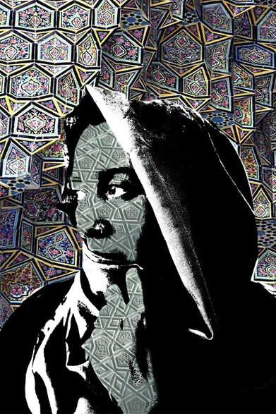
This is the final piece that I have decided to create and the fact that its very different from the rest of my work through this project I think was the end goal and to be more innovative with the images that I create. Further more in this image there is a lot of different components and ways that I created this. The process was quite simple but the final result makes it look alot more complex than it is, I changed the thresh hold of the image to create something purely that was just black or whitewash no tones or depth. The way that I incorporated depth into the image was by finding islamic patterns that had a 3D effect with made it look more colourful for one but the reason that I didn't leave the original image in colour was so that the patterns would stand out more and look more intricate, I then pasted the images on to the changed thresh hold and chose where I wanted my designs to go and then I enlarged them and rubbed out with the rubber tool on the right levels so that the other layers didn't get rubbed out as well. If I was to redo this image I worked take a lot more images so that there was more selection and so that the composition of how I can take pictures would be shown. I would also do more edits that I originally did so that I could have a variety of patterns and make more of the strand. Next time I also need to work on getting my images in focus so that they don't turn out so grainy. I think that my final piece sums up what I have been working toward through my project and that the colours really capture the essence of what I was trying to show through my project.
